Quote:
|
Originally Posted by Helm
Here's an edit explaining what I mean about clean-ness. Mainly look at the head. You can go as filthy as you want, but it's all texture. The idea is, there is ONE, DEFINED COUNTOUR at all times. Go nuts INSIDE the form, but the form should always pop out and be easily communicated to the viewer. I explained what I ment about the bent arm too, and rearranged the fingers in a more probable position. You should never work on a white background. It's impossible to colour properly, everything comes out too bright. Also, a character such as this should be worked even from pure black, so as to be more threatening. I also do not know who this character is, so excuse me if I didn't remain too faithful. I think for example, that the eyes really add to it.
Hope you don't mind the edit.
|
I understand what you mean about the defined contour, and I figured that's what you meant. I agree. My excuse for this being it was a rough job done for the thread submission, and I wasn't necessarily pulling out all my knowledge (though there's a good chance I wouldn't have anyway). It is something I need to focus on more if I plan on doing "legitimate" drawings.
I also see what you did with the arm, and I think that was also a fault of the lack of defined contour. The scribbled lines were going a little too wild and too far, and might have made the arm look disjointed.
The gun hand, I think I was trying to convey a sense that this creature was a bit stiff (hence the upright position), and therefore couldn't put the strength in his hand to really GRAB the gun, but just loosely hold it like a asian hooker performing a slow, loving handjob. That's a thought of retrospect when looking at your version though. Perhaps it's just a thought I need to develop more and convey better?
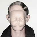
The white background was intended because, as you said, it made the colors seem brighter (going on the colored version, which was just an afterthought in itself). This was meant to reflect the bright colors of children's cartoons. The creature isn't supposed to necessarily look threatening. If anything, he's a sympathetic, tormented shell. I think the best way to say it would be "Captain N... what happened?" (In fact, I got a similar "Captain N, why?!" comment on the forums.) Same goes for the eyes. I just wanted these empty-looking holes, because I felt it fit the intended purpose of the drawing.
I'm not trying to pull excuses out of my ass here. These are thoughts I had, and I'm throwing them out to you so I can get your feedback on these thoughts. You obviously know what you're doing, but I'm wondering if that necessarily means I don't know what I'm doing.


 Linear Mode

