Anyone who has been reading comics for any decent length of time has
seen a shitload of different covers and cover styles, particularly if he
or she has been reading books of various genres. After a while it
becomes apparent to the frequent reader that there are a lot of
different comic cover clichés that get used over and over, to the point
that it eventually becomes a real challenge to find a cover that
actually stands apart as original or interesting. Some of these clichés
are ridiculous and entirely worth making fun of, while others actually
make sense but I'll still see if I can't poke a little fun at them
anyway. Because that's what I do. And I'm the best there is at what I
do, bub. No wait, that's Wolverine. I'm just an asshole with a comic
column. So here are some of the most common and most annoying or amusing
clichés that I've noticed in my twenty or so years of collecting. If
you've noticed any I didn't mention, email me and I may include them in
the upcoming Part 2.
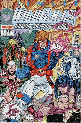
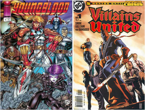
The Kodak Moment
Everybody say cheese...
This is hands down my absolute favorite least-favorite cover cliché, and
it's gotten to the point that I almost laugh out loud now when I see it.
It's been used pretty much ever since there were comic books but I don't
think any one company is guiltier of this cliché than Image was in the
early 90s. On this cover you have a group of heroes posing proudly, as
if for a camera about to take their picture. My favorite version of this
is when the heroes are all standing heroically on a rooftop gazing off
into the distance, presumably at a beautiful sunset, because if they're
actually scouting the city below for trouble, they're only bothering to
check in one direction grouped together like that. This is really a
superhero-team-book-only kind of thing, because you can actually have a
single hero standing and staring off in whatever direction without
looking too contrived, but a team? No way you can get around it; it just
looks ridiculously forced.
If you saw this in real life, you wouldn't be intimidated; you'd be
laughing.
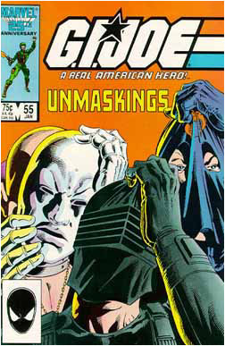
The False Advertisement
They may as well have also said 'Hey kid, by the way, Santa isn't real
either'.
This one isn't obvious when you first look at the cover on the shelf,
but instead only becomes apparent after you've shelled out money for the
book. What is illustrated on the cover never actually takes place inside
the book. Either there was some miscommunication between the writer and
the cover artist, or someone is fucking with people's expectations in
order to sell more copies. I remember one issue of G.I. JOE where
the cover promised that inside the issue Destro, Cobra Commander, and
Snake-Eyes would all be unmasked, finally to have their faces revealed
to the reader! Oh, they were unmasked alright… and they immediately
donned new disguises before we got a chance to see what they really
looked like. So technically it wasn't a lie, but it was damned
misleading and I was disappointed as hell.
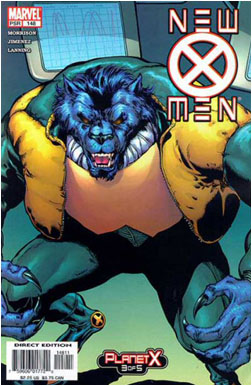
You might expect to actually see Beast somewhere in this issue. But
you'd be wrong.
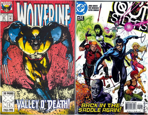
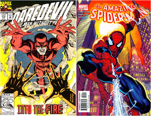
The Slightly Different Pose
From Last Month
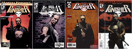
I'm looking for that issue where the Punisher was standing
there with a gun looking pissed off… do you have that one?
This is one of the most boring clichés, because you really do get the
exact same thing month after month on the same book. Tim Bradstreet is
an amazing artist and I love his work, but his Punisher and Hellblazer
covers have been a bit too repetitive for my taste. I'd rather see a
scene or an image involving something that happens in that particular
issue than see another image of Frank Castle standing there with a gun
and glaring at the reader, or John Constantine walking or standing on a
gritty and anonymous London street smoking a cigarette. And hey, maybe
it's not the artist's fault, it could be the editor of the book
dictating what they want on the cover, but either way I'm sick of it.
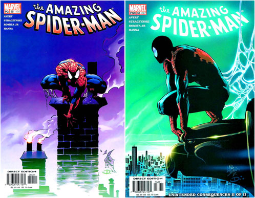
Spider-Man is another character guilty of this a lot: there are only so
many times we can see him swooping on a web or clinging to the side of a
building before it all starts to blur together.
Not only are these two poses pretty much exactly the same,
but these two issues were released back to back.
The Total-Spoiler
No doubt a lot of fans wore the same expression as a
major plot point was revealed on the cover.
This cover represents all the assholes of the world who give away the
ending of a story to everyone else, like in that episode of The Simpsons
when Homer walked out of The Empire Strikes Back
loudly declaring how surprised he was that Darth Vader was Luke's father
while passing by the next line of people waiting to see the movie. It
might present a striking or shocking image, but damned if it doesn't
piss off a lot of fanboys who are picky about that sort of thing. And
there's really no way to avoid it, as you kind of have no choice but to
notice the cover when you pluck it off the shelf. This cover is
particularly baneful to those people who will wait until an entire
mini-series or story arc is complete before reading it, because then
things that weren't spoilers to the people who were reading the book as
it came out get spoiled for those people (for example, the big secret
villain is revealed at the end of issue 1 and then appears on the cover
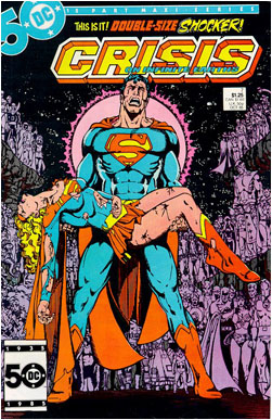
of issue 2). Of course, years later none of it matters because everybody
who reads DC comics knows that Supergirl died during the Crisis on
Infinite Earths, but at the time I'm sure a lot of people were
bitching about it.
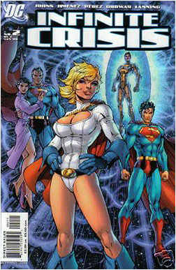
Oh gee, did you not know that all these characters were back from the
dead?
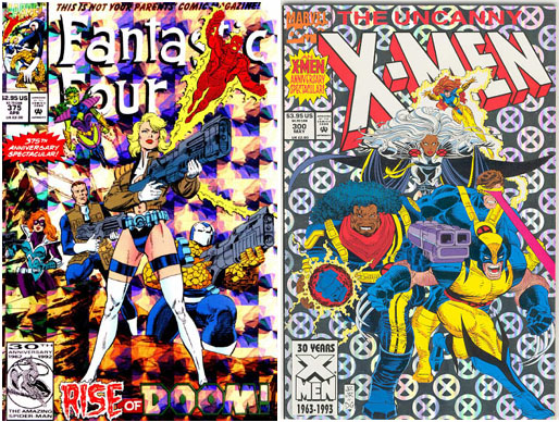
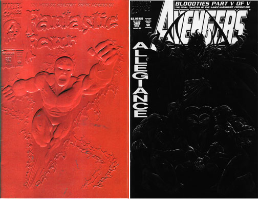
The "Bling"
Aaaaaaaaaaaagh! My eyes!!!
This horrid abomination was highly prevalent in the early 90s among all
major comic companies, but the two guiltiest parties seemed to have been
Marvel and Image. It was a terrible fad in the early 90s for special
occasion issues (and just about any damn thing you could think of could
qualify: 13th Anniversary! Eighth issue spectacular!) to be released
with gatefold kevlar foil sequined hypercolor chrome disco-ball covers,
because somebody high-up in one of the companies apparently thought it
looked great, and soon enough all the companies were doing it with
disturbing regularity to keep up with each other. The only hitch with
this idealized vision was that in reality it looked like shit. And you
couldn't go a week without at least five shiny covers blinding you with
their luminescent glare as you browsed the shelf for the comics you
wanted. Fortunately for everyone involved this fad faded out in the late
90s and now appears to be entirely dead. Mere mention of it seems to
provoke embarrassment from most of the companies, so that's a good sign
that it won't come back in zombie form.
These covers have so much bling I can't even tell what the fuck I'm
looking at.
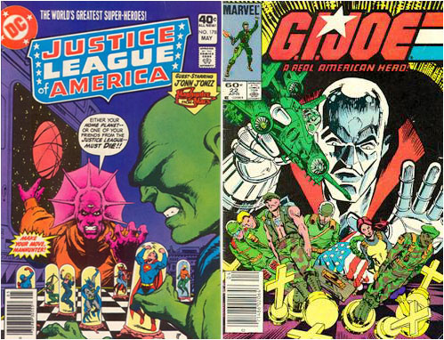
The Gamemaster with
the Giant Floating Head
Despero and Martian
Manhunter can have a civilized game of wits between them,
but Destro doesn't quite seem to have a grasp on the point of the game.
Showing the heroes as hapless pawns in some madman's twisted life-sized
game of chess was first done a long time ago, but has been copied many
times since (though not necessarily with chess). It's kind of a neat
idea but it's sort of been done to death by now. And if the characters
are on a life-sized chess board, why does the villain have a gigantic
floating head anyway? Why isn't his head normally sized, because when
the heroes inevitably bust their way through whatever gamey deathtraps
the villain has prepared for them, they enter his control room and the
villain is normally sized. What gives? Another variation of this (which
I believe came first) is to have a hero and a villain sitting and
playing chess with each other using their friends and allies as pieces.
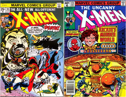
The X-Men seem to have a
chronic problem with the giant floaty head villains.
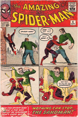
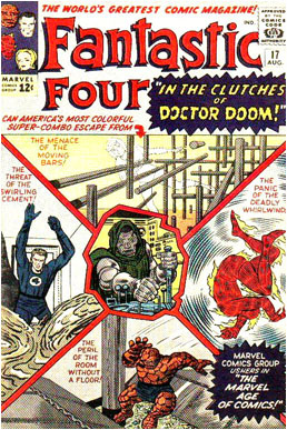
The Information Overload
Uh, did someone turn this book inside-out or something?
This jumbled mess is a more old school cover style, commonly used by
Marvel in the 60s, but it had been around long before that. This cover
tries to jam pack so much information on the front of the book that all
you end up with is a horrible eye-sore that doesn't really convey nearly
as much about the book as they might have hoped, since there is nothing
for your eyes to really focus on. Some of them are so bad that it almost
looks like an interior page has been ripped out of the book and stuck on
the front, because it almost looks like you're looking at a page with
panels. Fortunately this style died out sometime during the late
60s/early 70s but occasionally you'll see a parody or tribute cover that
copies that style today.
It's like the comic drooled its guts out all over its bib.
The Bum-Rush
Are they coming to save the day or to kick your ass?
This cover depicts the heroes running, swooping, swinging or otherwise
rushing towards the reader, as if you yourself are some terrible threat
that they have to stop, and if by some miracle they actually manage to
reach the plane that forms the cover itself, they can break through and
beat you to a pulp, as is the hero's way. It's as if to say "Hey, we
mean business because we don't just meander or mosey on towards whatever
villain is threatening the continuance of life as we know it, but we
skedaddle on along! We don't dilly-dally, no sir!" Sometimes the
characters are actually depicted bursting through the paper and coming
to get you.
In case you were tired of that whole 'running' thing, the heroes will
be
glad to swoop, swing, and dive to give you an ass whooping as well.
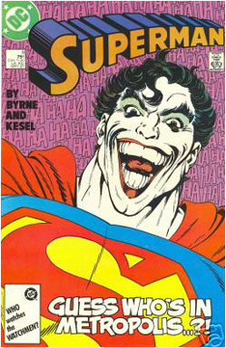
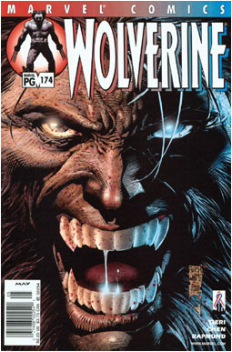
The Uncomfortably Intense Close-Up
He's so close that you feel like you're making out with him,
and the make-up certainly doesn't help...
This cover has a super extreme close-up portrait of some character's
face, to the point that you feel like you're invading their personal
space, which is a bad feeling to have because they aren't even real.
Often times the character (especially if it's Wolverine or the Thing)
will be making some witty quip, like "What are YOU lookin' at?" or
perhaps threatening you: "You want some?" This is also a way for the
artist to get away with not having to draw a lot of detail, if the
character has a simple face or wears a helmet. And they definitely don't
have to draw a background, which a lot of artists find annoying. In most
of these cases, the artist may as well have stamped "I didn't have any
good ideas" on the cover to finish the piece.
Smells like Wolverine had garlic for lunch...
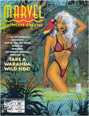
The T&A (aka "Teh Secks")
Surely this is a deep, thought-provoking comic
that tackles lot of important social issues.
This one should be obvious: a cover depicting some scantily-clad heroic
or villainous vixen, and not much else. A book like this just screams
"No substance to be found here!" but this is also the type of thing that
horny 12-year old boys buy up like hotcakes. I know, because I was once
a horny 12-year old boy, and I bought a lot of these comics. I did not,
however, buy up a lot of hotcakes now that I think about it, so perhaps
that analogy doesn't hold up. Regardless, these books always seem to do
fairly well, although they're not as popular or prevalent now as they
seemed to be in the 90s, when they got absolutely out of control and
seemed to account for about half the shelf. Hell, Image and Marvel even
used to do swimsuit specials, and that's pretty damned scary.
When Storm's not
busy killing bad guys with lightning, she likes
to lounge around in swamps with a parrot on her shoulder.
There, that's enough torture for now. Next time I'll have even more
comic cover clichés for you to enjoy. In the meantime, be sure to send
in your suggestions!