|
||||||
| FAQ | Members List | Calendar | Today's Posts | Search |
 Topic Review (Newest First)
|
| Apr 24th, 2005 03:04 PM | ||
| werewolf |
isnt it the meaning to post at threads then? am i so dumb or are u executioneer? |
|
| Apr 24th, 2005 12:08 PM | ||
| MetalMilitia | hey, I rember this thread! | |
| Apr 24th, 2005 11:25 AM | ||
| executioneer |
could you stop posting please 
|
|
| Apr 24th, 2005 07:32 AM | ||
| werewolf |
it looks cool!!!  
|
|
| Mar 2nd, 2005 11:53 AM | ||
| MetalMilitia |
I abandoned it becasue it sucks then forgot about it. Anyone can have the .PNG if they would like to mess about with it. |
|
| Feb 25th, 2005 01:24 AM | ||
| thebiggameover | or maybe add a hello kitty purse... | |
| Feb 25th, 2005 12:48 AM | ||
| ArrowX | If your still interested in working on the wallpaper might i suggest scattering cards in a pattern following the tracks. It woul look like he lost his entire "Deck" | |
| Nov 15th, 2004 03:33 PM | ||
| horror_blood | ogf | |
| Nov 7th, 2004 07:01 PM | ||
| Shoeless joe | Awesome man. Where'd you get the pokemon card, did it come with the severed hand you sliced off? | |
| Nov 7th, 2004 02:54 PM | ||
| racialslur |
Metalmilitia + Rez =  think of the accomplishments! |
|
| Nov 7th, 2004 12:59 PM | ||
| Mockery | Ok, whenever you guys have a final version, just let me know and I'll add it to the site. | |
| Nov 7th, 2004 12:55 PM | ||
| MetalMilitia |
Ok so i very slightly increased the blood saturation, increased the saturation on the main text, reduced the contrast on the asphalt and slightly increased the transparency on the tire tracks.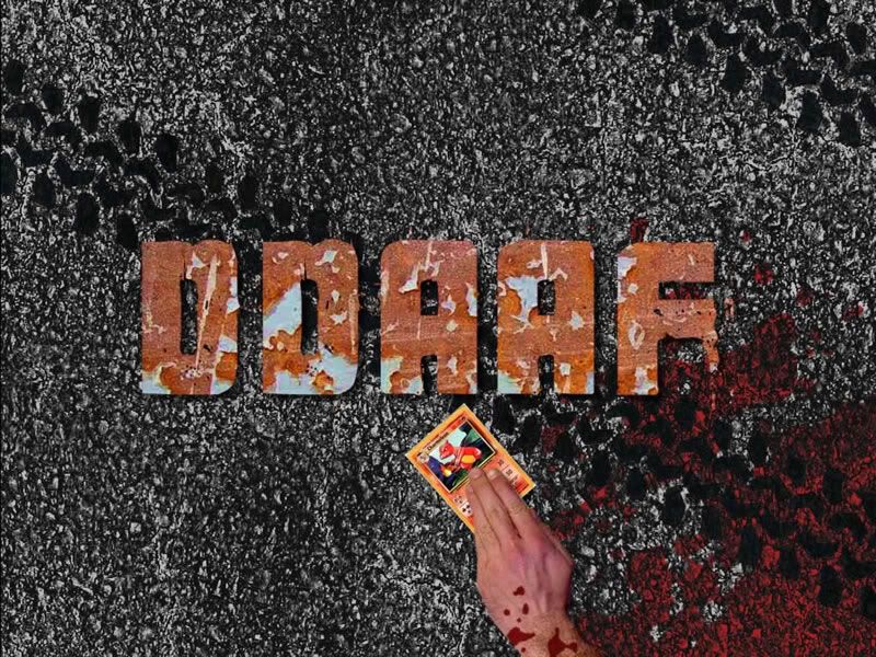 1024x768 | PNG file - 1024x768 (6mb) The icon texts are slightly more readable but its still not perfect so i have provided the .PNG file for anyone who wants to modify it as they see fit (or just want to steal the nice asphalt texture )
|
|
| Nov 7th, 2004 12:08 PM | ||
| Mockery |
Good, we need more wallpapers in that section. I had to whip up that one quickly just so we'd have something for site launch. Anyway, MetalMilitia, I suggest a little more saturation in both the logo and the blood. Also, do you have versions for 1024x768 and 800x600 screen resolutions? |
|
| Nov 7th, 2004 12:04 PM | ||
| pjalne | Yeah, not bad. Maybe the icon text thing will work out if you don't have that much contrast on the asphalt texture. That could make the skidmarks stand out a bit more as well. | |
| Nov 7th, 2004 11:49 AM | ||
| whoreable | thats actually pretty damn good. | |
| Nov 7th, 2004 11:27 AM | ||
| MetalMilitia |
Quote:
 Anyway...  still hard to rread text it though mabey i ould just make it a load smaller and say its a badge. Garg, forgot ot put the URL on it too. |
|
| Nov 7th, 2004 11:05 AM | ||
| pjalne | This Batcomputer isn't just here for decorative reasons, you know. | |
| Nov 7th, 2004 11:00 AM | ||
| MetalMilitia | good thinking batman. | |
| Nov 7th, 2004 10:51 AM | ||
| pjalne |
Set a bit of transparency to the layer. I'd also recommend you put in an anime-related element lying around with blood on it, like a power tiara or a Pokemon card. And the address to the site in a corner or something, or a small ".org" after the letters. Also, a wallpaper is a tad useless if you can't read icon text. |
|
| Nov 7th, 2004 10:43 AM | ||
| MetalMilitia | damnit, the more i look at it the more i hate the way the blood looks. any ideas on how i could change it? i think mabey a faint a texture might make it look better. | |
| Nov 7th, 2004 10:36 AM | ||
| MetalMilitia |
DDAAF wallpaper. No offence to whoever made it, but the wallaper on the site is somewhat awful so thought i'd have a go...  Tell me what you think? I noticed one problem with it that text on icons becomes unreadable when on it but other than that it looks nice :/ btw, i have it in 1024x768 too if anyone wants it. |
|